Airline Customer Review — Insights
In this new post series, we’re going to understand how clients from the top airlines in the world rate the service provided by these companies.
In order to accomplish this task, we first need to understand the business problem we’re solving. That’s what we’re going to discuss in this post, in the following posts you’ll learn how to build the proposed dashboard in an end-to-end approach.

All posts from this series:
- Airline Customer Review — Insights [This post]
- Airline Customer Review — Web Scraping
- Airline Customer Review — Power BI
Business Problem
An airline provides multiple options for clients to fly across the globe, like any other business segment this one also has competition to beat. In order to do that, the managers need to know if customers are satisfied with the services provided, and a good way to obtain this information is by getting online reviews.
The idea for this analysis came from a challenge proposed by British Airlines, by getting reviews from the website SkyTrax it’s possible to know how clients rate multiple aspects of the service provided by this company. We’re going a little further than the proposed challenge by analyzing the reviews from customers of the main airlines from the top 10 countries with the most travelers in the world in order to compare them.
This comparison allows managers to understand which metrics are essential for customer satisfaction and how they’re positioned in these aspects when compared with their competition.
Key Performance Indicators
Instead of just talking about metrics, now we’re going to dive a little further and understand which metrics will be used to analyze the success of companies accordingly to their clients.
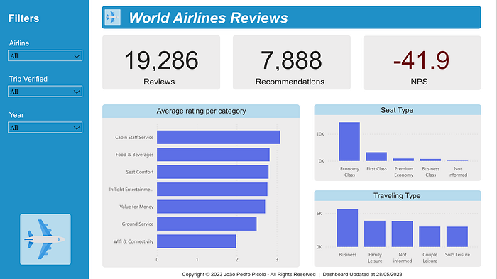
- Reviews: this metric represents how many clients left an online review about the service provided, it’s important to have this information to compare with the customer’s database to understand how well these clients actually represent the total number of clients
- Recommendations: as important as knowing how many clients left a review is to know how many of those clients would recommend the service provided by the analyzed airline, this is what this metric represents
- Net Promoter Score (NPS): this metric uses the two pieces of information described above to tell if a client is loyal to the company, or is vulnerable to competition offers, or will damage your company’s image. This metric is widely used in business scenarios and I recommend taking a look at other posts about it to understand it better
- Average Rating per Category: these are the categories to which a customer can assign a five-star rating. These categories will allow managers to understand what they’re doing better than their competition or which aspects of their service they should improve
- Seat Type: this metric intends to give managers a better understanding of the clients who are traveling in their company. This metric is particularly important to distinguish if a problem detected in one of the categories (metric above) is happening only to a particular segment of clients or to all of them
- Traveling Type: different reviews and perspectives can come from clients who were traveling for business reasons or family leisure, for example. Considering this, it’s also important for managers to understand the customer’s situation in the moment of review
Key Insights
Let’s start by analyzing the most important KPI: NPS. Only the information from the last 5 years will be considered:
- Azul (from Brazil) has the best NPS, scoring 52.2
- British Airways (from the United Kingdom) has the worst NPS, scoring -87.3
Based on this information let’s see what Azul is doing right:
- Azul has an average rating greater than 4 in every category except the Wifi & Connectivity
- These values increase among the passengers who bought tickets for the first class
- These values decrease among the passengers traveling with family
- All these statements remain true if we only check the data from the verified trips
Now let’s take a look at the British Airways data:
- For British Airways, all the categories have an average rating smaller than 3, such as Azul the Wifi & Connectivity inside the cabin received one of the worst ratings
- Since the value for money category is subjective, we’re not going to take that into account for now
- The third lowest category for the British is the Ground Service, this metric might indicate that the baggage is getting damaged during its handling
- Naturally, the overall ratings increase for the Business/First class mainly when looking at seat comfort but all the values keep below 3
These are just some of the insights that can be taken from the data we populated into our Power BI Dashboard. In this post, we just did a quick demonstration of how the dashboard can be used by any airline company to get useful information and perform improvements on its services.
A general recommendation would be for the companies to do a survey among their users to understand exactly what’s the reason for the low averages in each category. Further, it’s also important to notice that a good reason to do this survey is the fact that online reviews are biased because most of the reviews will come from clients who were so unsatisfied that they took some time out of their hurried routine to rate a company online.
Conclusion
Customer reviews are important pieces of information that can tell companies where their services should be improved. Even though this information is useful, it’s important to notice the limitations described above and perform custom customer surveys to avoid biases.
In the next posts, we’re going to build together the proposed project step by step. I hope this can be used for learning by as many people as possible, so feel free to contact me if you have any questions during the process.